Updating layouts for iPhone X
Apple generally provides us as developers plenty of notice to make updates, whether explicit or implied. There are a number of these that I have been doing slowly this year for various reasons—High Sierra, Swift 4, iPhone X layout. Starting at WWDC, we could have been updating our apps to be prepared for the iPhone X layout changes, although none of us knew exactly what to expect. All we knew was that “safe area layout guides” were a thing and we should be using them.
Since receiving my own iPhone X, I have been much more motivated to get my own apps updated to work better with the unique layout challenges. I wanted to capture some of the standard changes I find myself making repeatedly.
Note: I make heavy use of storyboards, so most of my explanations will involve Interface Builder.
Enable safe area layout guides
The first crucial step is to enable safe area layout guides in the storyboard. When updating from Xcode 8 to Xcode 9, this setting will be off by default, while any new storyboards created in Xcode 9 will have it enabled by default. Simply open the file inspector (the first inspector in the right pane in Xcode), and check the box named “Use Safe Area Layout Guides” to enable them.

Table views
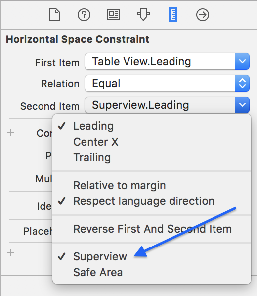
Through the content view in UITableViewCell, table views work almost magically with the iPhone X. One of the main changes I have found is that the table view itself needs to be constrained to the actual view of the view controller, and not the safe area. If you had the table view constrained to the edges in Xcode 8, when you enable the safe area layout guides, those constraints will be converted to be relative to the safe area. For a table view, you don’t want that. You need to go in and modify each constraint to be relative to the superview instead.

Custom separators
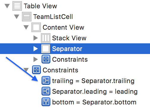
Many of my custom table view cells will have a custom separator line. This is common if different cells in the same table need to have different separators. Typically, those views were constrained to the content view of the cell. However, that will leave the separators inset when in landscape mode because of the safe area layout guides. Instead, constrain the views to the cell itself. The exception to this rule is for separators that should be inset, typically on the leading edge. In that case, the leading edge of the view should remain constrained to the content view of the cell in order to retain the proper inset.

Extra bottom view
Many designs have a view at the bottom of the screen. This view would typically be constrained to the bottom layout guide previously, and that constraint would be converted to be relative to the safe area. This will leave an unsightly gap at the bottom of the screen.
 Bottom view constrained to safe area
There are two solutions I have used to correct this situation. The first is to simply add an extra UIView with a matching background color below the original view. That view will be constrained to the leading and trailing of the original view, and the bottom will be constrained to the superview—not the safe area. Then with a vertical spacing constraint between the views, you are set. When on a device where the safe area is the bottom of the device, the extra view will have a height of 0. On the iPhone X, the extra view will go from the bottom of the screen up to the bottom of the safe area.
The other solution is very similar, but instead of placing the view below your original view, it is embedded inside of it with a clear background color. Then you change the constraints of the original view to be to the superview and not the safe area. Then any views you have inside of your original view will have their bottom relative to this new spacer view. This is definitely the preferred solution if your original view is a visual effect view.

Summary
There are many more adjustments to consider when updating an app for the iPhone X, but these are the most common situations I have encountered. I look forward to having my apps feel at home on this new device.
